Please note, in case you override the 'Continue' button and add additional steps/screens to the payment flow, you need to return to the SmartPayPaymentFragment.
Android SDK
Last changes: 03-09-2021
Activity mode
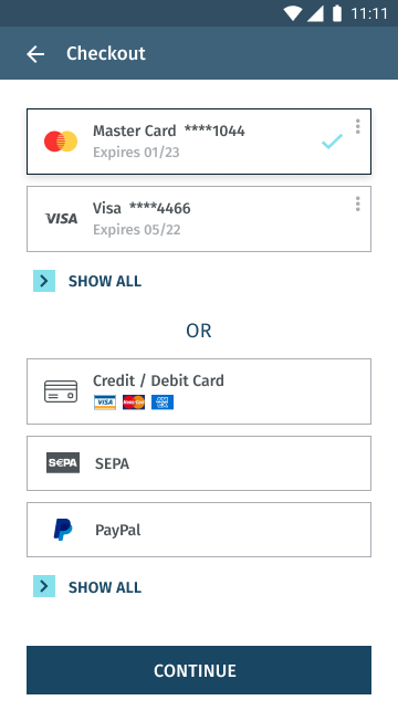
The SmartPay Activity Mode provides you with a complete checkout screen. The user can navigate back to the previous activity by just pressing the back button.
Fragment mode
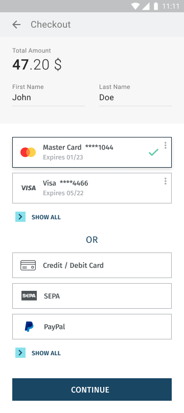
The SmartPay Fragment Mode allows you to integrate the SmartPay fragments directly into your app experience and gives you maximum control over the various checkout elements.
To integrate the SmartPay libraries into your project, there is a necessity to perform a few basic tasks to prepare the project. This tutorial assumes your IDE for application development is Android Studio.
First, copy SDK files (listed below) to the module “libs” folder (usually the app/libs/):
- smartpay.arr
- kontocloud-sdk.aar
- kontocloud-apiclient.aar
- kontocloud-uicomponents.aar
Then, in your module Gradle file (usually the app/build.gradle), add the dependencies for the SmartPay libraries:
apply plugin: 'kotlin-android'
apply plugin: 'kotlin-android-extensions'

android {

compileOptions {
    sourceCompatibility JavaVersion.VERSION_1_8
    targetCompatibility JavaVersion.VERSION_1_8
}

kotlinOptions {
    jvmTarget = JavaVersion.VERSION_1_8.toString()
}

}

repositories {
    flatDir {
        dirs 'libs'
    }
}

dependencies {
 // …
implementation 'androidx.core:core-ktx:1.3.0'
implementation 'com.google.android.material:material:1.1.0'
implementation 'androidx.constraintlayout:constraintlayout:1.1.3'
implementation "androidx.fragment:fragment:1.2.5"
implementation "androidx.fragment:fragment-ktx:1.2.5"

implementation 'com.squareup.retrofit2:retrofit:2.9.0'
implementation 'com.squareup.retrofit2:converter-gson:2.9.0'
implementation 'com.google.code.gson:gson:2.8.6'

implementation 'net.danlew:android.joda:2.10.6'
implementation 'com.samskivert:jmustache:1.15'

implementation(name: 'smartpay', ext: 'aar')
implementation(name: 'kontocloud-apiclient', ext: 'aar')
implementation(name: 'kontocloud-uicomponents', ext: 'aar')
implementation(name: 'kontocloud-sdk', ext: 'aar')
}
Add the INTERNET permission to the AndroidManifest file (usually the app\src\main\AndroidManifest.xml):
// ...

<uses-permission android:name="android.permission.INTERNET" />

//...
To initialize the SmartPay:
Kotlin

class App : Application() {
override fun onCreate() {
   super.onCreate()
   SmartPay.init(this)
Make sure to set the correct environment / smartPayMode in the smartPayOptions:
| Environment | SmartPayMode |
|---|---|
| Sandbox | CONS |
| Live | PROD |
Kotlin

class App : Application() {


override fun onCreate() {
   super.onCreate()

   val smartPayOptions: SmartPayOptions = SmartPayOptions()
     smartPayOptions.smartPayMode = SmartPayMode.Live
SmartPay.init(this, smartPayOptions)Initialize SmartPay
To initialize SmartPay SDK forward transaction-ID to the startActivityForResult method.
Kotlin

SmartPayCheckoutActivity.startActivityForResult(Context, TRANSACTION_ID)
Process Payment Results
To receive the transaction results, please override the method in Activity.onActivityResult. In the response requestCode == SmartPayConst.SMART_PAY_PAYMENT_REQUEST_CODE you can recieve the following results codes:
| Result Code | Description |
| SmartPayConst.SMART_PAY_RESULT_CODE_CANCEL | The end-customer has canceled the transaction (i.e. closed the payment form window). |
| SmartPayConst.SMART_PAY_RESULT_CODE_ERROR | Transaction has failed. |
| SmartPayConst.SMART_PAY_RESULT_CODE_SUCCESS | Successful transaction execution |
To get the transaction-ID related to the processed payment extract the key SmartPayConst.SMART_PAY_TRANSACTION_ID.
Kotlin

override fun onActivityResult(requestCode: Int, resultCode: Int, data: Intent?) {
    super.onActivityResult(requestCode, resultCode, data)

    if (requestCode == SmartPayConst.SMART_PAY_PAYMENT_REQUEST_CODE) {
        val transactionId = data?.getStringExtra(SmartPayConst.SMART_PAY_TRANSACTION_ID) ?: ""
        when (resultCode) {
            SmartPayConst.SMART_PAY_RESULT_CODE_SUCCESS -> {
            ...
            }
            SmartPayConst.SMART_PAY_RESULT_CODE_CANCEL -> {
            ...
            }
            SmartPayConst.SMART_PAY_RESULT_CODE_ERROR -> {
            ...
            }
        }
    }
}
The SmartPay Activity Mode can inherit the main application's theme by adding the following attribute (for more details see the Styling section):
<style name="AppTheme" parent="Theme.MaterialComponents.Light.DarkActionBar">
    <item name="smartPayStyle">@style/MySmartPayStyle</item>

</style>

Kotlin
SmartPayCheckoutActivity.startActivityForResult(Context, TRANSACTION_ID, R.style.AppTheme)Kotlin
SmartPayCheckoutFragment.getInstance(TRANSACTION_ID)
Callbacks
To receive response callback from the fragment, your activity must be inherited from the Interface OnSmartPayEventListener.
| Callback | Description |
| onSmartPayApiError() | There was an error during payment process. In case the payment must be continued, open the screen from the beginning. |
| onSmartPayPaymentOptionStored() | The payment option has been successfully stored. Return to the SmartPayCheckoutFragment screen and call SmartPayCheckoutFragment.reloadPaymentOptions() method or add a fragment again. |
| onSmartPayPaymentFinishSuccess() | Payment has been successfully processed. The screen can be closed. |
| onSmartPayPrepareFragment() | Preparation of the screen, please disable buttons which lead to payment. |
| onSmartPayReadyFragment() | The next step of the payment process can be performed. |
interface OnSmartPayEventListener {
    fun onSmartPayApiError()
    fun onSmartPayPaymentOptionStored()
    fun onSmartPayPaymentFinishSuccess()

    fun onSmartPayPrepareFragment()
    fun onSmartPayReadyFragment()
}
To override the 'Continue' button in SmartPayCheckoutFragment use the following method:
SmartPayCheckoutFragment.setOnClickConfirmButton(onClick: View.OnClickListener?)To add SmartPayPaymentFragment screen:
SmartPayPaymentFragment.getInstance()
Confirmation Button
The Fragment Mode allows to change text of standard buttons. Please note, that only @StringRes is supported. Moreover you can hide standard buttons in order to use your main application buttons (e.g. to add additional steps / screens).
SmartPayCheckoutFragment.setTextConfirmButton(@StringRes textRes: Int)
SmartPayPaymentFragment. setTextConfirmButton(@StringRes textRes: Int)
To hide the 'Confirm' button in SmartPayCheckoutFragment/SmartPayPaymentFragment:
visibility -> View.VISIBLE, View.INVISIBLE, View.GONE


SmartPayCheckoutFragment.setVisibilityConfirmButton(visibility: Int)
SmartPayPaymentFragment. setVisibilityConfirmButton(visibility: Int)
SEPA Mandate Buttons
While the end-customer pays with SEPA payment option, the mandate with terms and conditions is shown. While the end-customer clicks 'Agree' or 'Cancel' buttons, you will receive the callback with the result. If the end-customer clicks 'Cancel' it is necessary to return to the payment selection screen.
Your activites must inherit the properties of the OnSmartPayMandateListener interface to receive callbacks.
interface OnSmartPayMandateListener  {
    fun onSmartPayMandateCancel()
    fun onSmartPayMandateAccept()
}
interface OnSmartPayClickPaymentMethod  {
    fun onSmartPayClickStoredPaymentMethod(transactionId : String, storedPaymentOption: SmartPayStoredPaymentOption)
    fun onSmartPayClickGuestPaymentMethod(transactionId : String, guestPaymentOption: SmartPayGuestPaymentOption)
}
Methods
| Method/Class | Description |
| onSmartPayClickStoredPaymentMethod | Called when the end-customer selects already stored payment option or default payment option |
| onSmartPayClickGuestPaymentMethod | Called when the end-customer selects payment option that hasn't been already stored or after updating of the screen when there is no stored payment options |
| SmartPayStoredPaymentOption | Class contains information about stored payment option |
| GuestPaymentOption | Class contains information about the new initiated payment |
OnSmartPayClickPaymentMethod – Activity must inherit properties of OnSmartPayClickPaymentMethod, to receive callbacks.
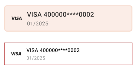
Payment Option Selection
SmartPayPaymentView is implemented to show already selected payment option by the end-customer to pay the order. This element can be designed separately from the main theme. To have everything working correctly this element need to be shown only after the end-customer has selected a payment option to pay on the SmartPayCheckoutFragment screen. Both, adding from the code or the markup is supported.
interface OnSmartPayClickPaymentMethod  {
    fun onSmartPayClickStoredPaymentMethod(transactionId : String, storedPaymentOption: SmartPayStoredPaymentOption)
    fun onSmartPayClickGuestPaymentMethod(transactionId : String, guestPaymentOption: SmartPayGuestPaymentOption)
}
Payment Option View
There is a SmartPayPaymentView implemented to show already selected payment options by the end-customer to pay for the order. This element can be designed separately from the main theme. To have everything working correctly this element must be shown only after the end-customer has selected a payment option to pay on the SmartPayCheckoutFragment screen. Both adding from the code or from the markup is supported.
--Adding from the code--

val paymentView = SmartPayPaymentView(Context)
ViewGroup.addView(paymentView)

--Standard style from the activity theme--

<com.fspay.smartpay.sdk.ui.custom.SmartPayPaymentView/>


--Changed theme--

<com.fspay.smartpay.sdk.ui.custom.SmartPayPaymentView
    style="@style/SmartPayStyleView"
/>

<style name="MyStylePaymentOption">
    <item name="smartPayStyle">@style/MySmartPayStyle</item>
</style>

<style name="MySmartPayStyle" parent="SmartPayDefaultStyle">
    <item name="smartPaySi... >
</style>
To update SmartPayPaymentView:
val smartPayPaymentView = SmartPayPaymentView(this)
smartPayPaymentView.updateView()
Inherit Main Application Style
By default, the checkout theme will be inherited from the basic colors defined in main application.
| Basic Properties |
| android:colorBackground |
| colorControlActivated |
| colorOnBackground |
| colorOnPrimary |
| colorOnSurface |
| colorPrimary |
| colorPrimaryDark |
| colorSecondary |
To inherit the main applications theme for the SmartPayPaymentView it is necessary to set the following attribute:
<style name="AppTheme" parent="Theme.MaterialComponents.Light.DarkActionBar">
    <item name="smartPayStyle">@style/MySmartPayStyle</item>

</style>

<style name="MyStylePaymentOption">
    <item name="smartPayStyle">@style/MySmartPayStyle</item>
</style>
It is recommended to inherit from SmartPayDefaultStyle theme to avoid mistakes with missing reference attributes.
<style name="MySmartPayStyle" parent="SmartPayDefaultStyle">
<declare-styleable name="SmartPayAttrStyle">
    <attr name="smartPayColorBackgroundFragment" format="color" /> <!-- background color fragment/activity -->

    <!-- Button Confirm -->
    <attr name="smartPayColorButtonConfirm" format="color" />
    <attr name="smartPayColorButtonConfirmSelected" format="color" />
    <attr name="smartPayColorButtonConfirmRipple" format="color" /> <!-- button click -->
    <attr name="smartPayColorButtonConfirmCorners" format="dimension" />
    <attr name="smartPayColorButtonConfirmText" format="color" />
    <attr name="smartPayColorButtonConfirmSelectedText" format="color" />
    <attr name="smartPayColorButtonConfirmDeactivatedText" format="color" />
    <attr name="smartPayColorButtonConfirmDeactivated" format="color" />

    <!-- text -->
    <attr name="smartPayColorPrimaryTextColor" format="color" />
    <attr name="smartPayColorSecondaryTextColor" format="color" />
    <attr name="smartPayColorSelectedText" format="color" />
    <attr name="smartPayColorShowAll" format="color" />
    <attr name="smartPaySizePrimaryText" format="dimension" /> <!-- 14sp -->
    <attr name="smartPaySizeSecondaryText" format="dimension" /> <!-- 13sp -->
    <attr name="smartPayColorImageShowBackground" format="color" /> <!-- background image arrow (show all) -->

    <!-- card -->
    <attr name="smartPayColorSelectedCardImageTint" format="color" />
    <attr name="smartPayColorSelectedCardBackground" format="color" />
    <attr name="smartPayColorCardBackground" format="color" />
    <attr name="smartPayColorCardBorder" format="color" />
    <attr name="smartPayColorSelectedCardBorder" format="color" />
    <attr name="smartPayColorCardRipple" format="color" /> <!-- card click -->
    <attr name="smartPaySizeCardBorder" format="dimension" />
    <attr name="smartPaySizeCardRadius" format="dimension" /> <!-- default 0dp -->
    <attr name="smartPayRetryButtonBorder" format="color" />
    <attr name="smartPaySelectedRetryButtonBorder" format="color" />
    <attr name="smartPayRetryButtonBackground" format="color" />
    <attr name="smartPaySelectedRetryButtonBackground" format="color" />
    <attr name="smartPayRetryButtonSizeBorder" format="dimension" />
    <attr name="smartPayRetryButtonSizeRadius" format="dimension" />
</declare-styleable>| Attribute name | Description |
|---|---|
| smartPayColorBackgroundFragment | Background color |
| Button | |
| smartPayColorButtonConfirm | 'Confirm' button color |
| smartPayColorButtonConfirmSelected | Pressed 'Confirm' button color |
| smartPayColorButtonConfirmRipple | Color of the ripple effect of the 'Confirm' button |
| smartPayColorButtonConfirmCorners | Curving of the 'Confirm' button borders |
| smartPayColorButtonConfirmText | 'Confirm' button text color |
| smartPayColorButtonConfirmSelectedText | 'Confirm' button text color while the button is pressed |
| smartPayColorButtonConfirmDeactivatedText | Button text color with condition: Enabled = false |
| smartPayColorButtonConfirmDeactivated | Button color with condition: Enabled = false |
| Payment Option | |
| smartPayColorPrimaryTextColor | Color of the main text of the payment option |
| smartPayColorSecondaryTextColor | Color of the additional text of the payment option |
| smartPayColorShowAll | Text color for labels: 'Show all', 'Show less', 'OR' Text color for the arrow. |
| SmartPaySizePrimaryText | Main font size |
| smartPaySizeSecondaryText | Additional font size |
| smartPayColorImageShowBackground | Arrow background color; 'Show all/less' background color; |
| smartPayColorSelectedCardImageTint | 'Check mark' color |
| smartPayColorCardBackground | Payment oprion background color |
| smartPayColorSelectedCardBackground | Selected payment option backgorund color |
| smartPayColorCardBorder | Payment oprion border color |
| smartPayColorSelectedCardBorder | Selected payment option color |
| smartPayColorCardRipple | Ripple effect color |
| smartPaySizeCardBorder | Payment option border size |
| smartPaySizeCardRadius | Payment options border curving size |
Document version 1.0 - 2021-03-08 - Initial release